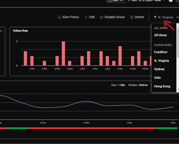
A discussion took place about the graphs on ControlUp related to PING scouts – while users can select a specific hive, it was suggested that it would be beneficial to have them all plotted on one graph for easier comparison. The option for separate hive graphs can be found by clicking the drop down menu.
Read the entire ‘Improve Data Analysis with ControlUp’s Graph Options’ thread below:
For PING scouts, are the graphs plotting an average of all scouts?
It would be nice to see them plotted separately.

Hit the drop down and you can select per hive and get the specific Graphic @member

thx
still would be nice to see them on 1 graph to compare visually.
yeah i agree 🙂
Continue reading and comment on the thread ‘Improve Data Analysis with ControlUp’s Graph Options’. Not a member? Join Here!
Categories: All Archives, ControlUp Synthetic Monitoring
