A new live RMM feature has been released by ControlUp, which includes a three second interval temperature graph. This feature is separate from the default historical view, but a custom dashboard can be used to display the information. Updates to the historical view may be released in the future.
Read the entire ‘ControlUp Releases New Live RMM Feature with Temperature Graph’ thread below:
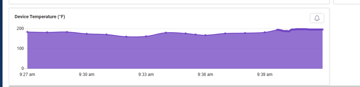
I noticed a new temperature graph available to me when I look at a specific device using the "now" timeframe in DEX. Historical graphing of that doesn’t seem to exist.
Hi Alex,
The Now view is part of the new live RMM feature we released this quarter. Its showing the realtime 3 second data as it arrives in the platform.
Not all of the new live RMM metrics appear in the ‘historical’ view, but a custom dashboard should help you show the information if required. I would expect further updates to the default historical view in the future.
Continue reading and comment on the thread ‘ControlUp Releases New Live RMM Feature with Temperature Graph’. Not a member? Join Here!
Categories: All Archives, ControlUp Dashboards, ControlUp for Desktops, ControlUp Live Remote Management