Some employees were discussing the combination of Device Score and Experience Score in a consolidated view or score. @member asked if there was any built-in reports or dashboards to view this combination, and @member answered that it exists within the DEX Score Trending Dashboard from the Dashboard Gallery. However, there was some confusion as to whether this data is based on the Device Score or the Experience Score. It was clarified that the metric used is the Experience Score, and the breakdown of this score can be found in the Employee module. The team discussed different ways to view and analyze this information, and it was suggested that a call be set up for a deeper dive into the dashboards. The conversation also referenced ControlUp URLs such as https://support.controlup.com/docs/device-score and https://support.controlup.com/docs/experience-scores.
Read the entire ‘How to View Device and Experience Scores in ControlUp Dashboard’ thread below:
Hi ControlUp team, quick question: Are there any built-in reports, dashboards, or scoring views that combine Device Score and Experience Score into one consolidated view or score? Or are these intended to be reviewed separately but used together for troubleshooting?
So you’re talking about the 2 real-time scores from the devices details page (list view) and the employee page? I don’t think that combination currently exists anywhere, but since both are in indexes, it should be possible to update the experience score dashboard with some type of aggregation @member?
Tagging @member for visibility also
Hey @member, regarding the DEX Score Trending Dashboard from the Dashboard Gallery, is the data shown based on the Device Score or the Experience Score?
Dex score
I know it says DEX, but in the ControlUp documentation, it says Device Score or the Experience Score.
So which is it?
https://support.controlup.com/docs/device-score
https://support.controlup.com/docs/experience-scores
….or give me the link that talks about what makes up the DEX score
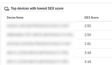
This is from you dashboard. I have leadership asking me a simple question. "What caused this computer to have a DEX score of 2.50?" if I cannot use Device Score or the Experience Score, then what documentation can I read so I can help explain it?
@member or @member can you please help the dashboard uses the dex score metric from devices_status I believe it is experience score but please confirm.
I answered my own question. The metric is the Experience Score.
I cross-referenced that specific computer in the Employee module over a 30-day period, and the 2.5 score matches perfectly.
What I still need to understand is where I can find the detailed breakdown that explains why this computer, and others with similar scores, received that rating. For example, I’m looking for the factors behind the score, such as X, Y, or Z.
Currently that information is exposed inside Employee only. The Experience over time widget in the employee profile page shows the score per hour in the ‘today’ view, which should pinpoint the place where the experience is poor/fair. Clicking on the bar opens the blade with the detailed breakdown of what happened during that time.
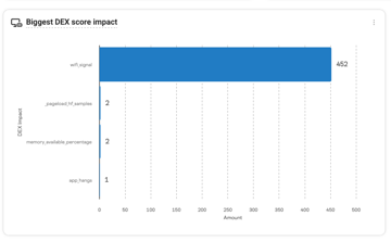
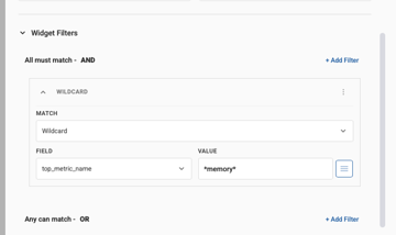
@member Another way is If you filter the DEX dashboard to that device then this widget will tell you what caused the low dex score the bars show you what was the highest impact on the dex score and the amount is amount of minutes in your time frame so for example if you set the dashboard to 7Days and see the widget screenshot in the past 7 days this user had 452 minutes of bad wifie experience and 2 minutes of pageload issues, 1 apphangs and 2 minutes of low memory available
Appreciate the response and suggestion.
It’s great to look at it from an individual device perspective, but I’m working with 100,000-plus workstations. I simply cannot ask the team reviewing this data to go to the dashboard and filter one device at a time just to see why the score is what it is.
What else do you suggest for doing this at scale?
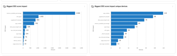
Hi Arthur If you dont filter the dashboard it al ready works great
for example
these 2 widgets together tell me that out of the last 7 days 60 devices had 3568 of degraded memory performance
Which 60 devices?
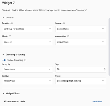
To find out which 60 they are you can use the device health dashboard and filter on undersized with cause = ram and it should come close to these 60 devices. If not you can build a widget to filter on it let me build it for you
"device health dashboard"
yes, the DEX score trend was inteded as a high overview C-level dashboard to not deepdive into too much. It does show the worst performing devices and you can click into them or filter the dashboard on it
I might be oversimplifying this, but it’s almost like you would have the computer name, the score, and then a third column that lists all the reasons why it received that score of 2.5.
From there, you could begin filtering to suit your needs. For example, you may want to see all low-scoring machines where the score is predominantly being caused by a background crash, or exclude certain reasons from the view.
this is how you would get the devices
So I need something between C-level and manually going through 100,000 computers.
Thats exactly how the device health dashboard works
name score reason
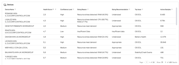
you can use the top filters to filter the grid down
you can click on the donuts and bars
But the Device Health dashboard is only looking at the device score and not the experience score, correct?
Experience score is a part of it
Ah, so it is part of it.
they should overlap closely this looks at ram, cpu, errors, crashes, app hangs, battery health, os support etc
we share the exact algorithmes here https://support.controlup.com/docs/device-health-score-algorithms-and-calculations
the issue with the DEX Score it is saved everyminute its a historical value so it always need aggregations so you can’t make a table with just name, score, and reason because that changes in the time frame and aggregation type. We dont have something like group by name and show only the top reason that is in technical terms a double Terms aggregation which is not possible currently in dashboarding
then you would just have raw data rows, so for each device each minute and the reason for the score for that minute
thats why we introduced the device health score its a pre calculated dashboard taking this data of the last 30 days and making just 1 number we can display in a grid
I hope this makes it a bit more clear, if needed we can setup a call to deep dive dashboards together. And add missing widgets that you need. The dashboard gallery is suposed to be templates that you can tweak to your need for example add extra details 🙂
Continue reading and comment on the thread ‘How to View Device and Experience Scores in ControlUp Dashboard’. Not a member? Join Here!
Categories: All Archives, ControlUp Dashboards, ControlUp for Desktops