A user asked for clarification on the CPU utilization graphs in the User Session Details / Performance view. Another user explained that the CPU Max graph shows the highest 3-seconds sample during a 5-minute period, which can cause spikes of 100% even if the host and user CPU numbers are only at 10%. The original user was directed to the documentation for further explanation.
Read the entire ‘Understanding CPU Max in ControlUp Performance View’ thread below:
Hey team – I have a question about the CPU utilization graphs from the User Session Details / Performance view.
I’d like to understand better what the CPU Max graph is showing me. I see spikes of 100% on that row, when the host and user CPU numbers are maxing out at 10%. Clicking the data point on the graph doesn’t show me anything. The example in the docs (https://support.controlup.com/docs/user-session-details-report) doesn’t show that line at all.
What am I being shown here with the CPU Max data? Thanks!
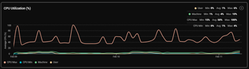
Hi @member, for each historical 5-min data points in our VDI historical database, we have the following data available:
- Min – the one 3-seconds sample with the lowest CPU% number out of all 3-seconds samples in the 5-min duration
- Avg. – an average of all 3-seconds samples we got during the 5-min duration
- Max – the one 3-seconds sample with the highest CPU% number out of all 3-seconds samples in the 5-min duration
so Max here can be a single 3-seconds sample with the highest peak out of each 5-min (or the one hour / one day aggregated data point)
let me verify that and update here
Continue reading and comment on the thread ‘Understanding CPU Max in ControlUp Performance View’. Not a member? Join Here!
Categories: All Archives, ControlUp for VDI