
A user named Seb shared three ControlUp UCC dashboards that use Microsoft Teams API data only - no CU4D agent needed. The dashboards show real Teams call quality and usage before the agent reaches the endpoints. It includes graphs for daily, weekly, and monthly trends, as well as MOS bands and per-user statistics. These dashboards can be customized to specific needs. Other users showed appreciation for Seb's contribution.
Read the entire article here...
ControlUp Dashboards
Proactively Managing Thin-Client SSD Wear: A New Endpoint Script from ControlUp Community Members
A user shared an endpoint script (zzSP_Prod_IGEL_Thinclient_SmartStatus) that can be used in IGEL or thin-client environments to gather information about SSD and storage wear. The script shows important details such as wear level, TB written, and pre-EOL state and can be helpful in proactive hardware-lifecycle management. The dashboard and script are available for use.
Read the entire article here...
Read the entire article here...
ControlUp’s Future Plans for Synthetic Monitoring Dashboard Widget
A user asked about a Dashboard widget for Synthetic Monitoring. ControlUp responded that it is not yet available but there are plans to add it in the future. There is also a playful discussion about ControlUp's AI and the potential of winning the lottery with its predictions. No further information on the widget was provided.
Read the entire article here...
Read the entire article here...
Importing Tagged Data from ControlUp with API and Workflows
A user is trying to export historical data from ControlUp, but is facing issues with their complex Active Directory structure and use of tags. They ask for suggestions on an easier or better way. Another user suggests using the API with device queries to filter the data, and provides an explanation with practical examples. They also mention that this can be utilized in Workflows with the Get Custom Data node. It is also mentioned that the user's desired result is possible.
Read the entire article here...
Read the entire article here...
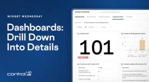
Widget Wednesday #23: Linked Drill-Down Dashboards
Widget Wednesday #23 introduces linked drill-down dashboards in ControlUp, allowing users to move from overview dashboards to detailed views for crashes, scripting, and AI usage with a single click.
Read the entire article here...
Read the entire article here...
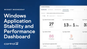
Widget Wednesday #22: Windows Application Stability and Performance Dashboard
Widget Wednesday #22 explores the Windows Application Stability and Performance Dashboard, providing insights into application crashes, hangs, freezes, resource usage, launch performance, and version comparisons.
Read the entire article here...
Read the entire article here...
How to Pinpoint CPU-Heavy Processes Across Your VDI Fleet with ControlUp
This thread walks through a real customer question: how do you find which processes are eating the most CPU across a large VDI estate (200 servers) over a long period, so you know what to optimize?
It starts in ControlUp Dashboards. Using the VDI process data, you can build a widget showing top processes by CPU, then narrow it to the machines you care about using global filters (filter by folder, or switch to query filters with IS / IS NOT). A table beats a bar chart for a top-50 view, and any filters and time frames you set are saved in the URL, so you can bookmark or share the exact view. The built-in Gallery dashboards (notably "Big Screen Dashboard VDI") already include a processes-by-CPU widget out of the box.
The harder part is the one the customer really cared about: getting a meaningful picture across all machines rather than a single noisy spike on one box. The data is stored per process per 5-minute timeslot, not pre-aggregated per machine, so the practical approach that emerged was:
Filter to the folder containing all target machines.
Use CPU usage P95 to strip out short, expected spikes (with a fallback to average CPU, since P95 returned N/A in some environments — a possible bug worth a support ticket).
Add metrics under Advanced: computer_name (unique count) to see how many machines run the process, and process_name (count) to see how often it appeared (each record ≈ a 5-minute aggregate).
The processes worth optimizing are the ones combining high CPU + high machine count + high record count.
Worked example: a process showing ~1,080 records across 197 machines roughly translates to ~90 hours of activity over 7 days, or a few minutes per machine per day. The same method surfaced candidates like CompatTelRunner.exe, WerFault.exe, and WEM-related activity for further investigation. To go deeper, the App Trends and App Statistics reports let you drill into a specific app, and product_name data helps identify what's actually behind generic process names like setup.exe.
A few important caveats came up: averages hide spikes (10% average could be one minute at 100%), process counts are per machine, and hypervisor-level CPU (e.g., XenServer) can disagree with in-VM agent data when hosts are over-provisioned — which is also why a Sizing Recommendations report may suggest removing vCPUs even on a machine that looks maxed out.
Bottom line: use the dashboard to identify the heavy processes (folder filter + P95/avg CPU + machine count + record count), then use the App Trends report to dig into the details per app.
Read the entire article here...
Read the entire article here...
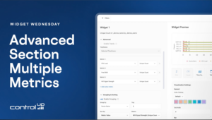
Widget Wednesday #21: Working with Multiple Metrics in Dashboards
Widget Wednesday #21 explores multi-metric support in ControlUp Dashboards, including aggregated tables, sorting, time series visualizations, and support for VDI and DAS IQ data.
Read the entire article here...
Read the entire article here...
Efficient Scripts for Managing Persistent VM Usage in VDI
A user was looking for a script to manage the usage of persistent VMs in VDI. @member suggested using a dashboard or workflow, and @member had a script for this purpose. Another option mentioned was to check the user session count for a machine to see if it has been used in a given time period. @member explained that this script may not be efficient and provided examples for a better approach. It was also mentioned that a report could be created using this method.
Read the entire article here...
Read the entire article here...
Creating a Campus-Specific Wifi Dashboard with ControlUp
A discussion took place in ControlUp about building a dashboard for monitoring WiFi network experience based on SSID in four different campuses using the same name but different IP ranges. The suggestion of filtering by subnet on the new 2.18 version was brought up, but it was also recommended to group by BSSID for a better understanding of performance. The use of wildcards in filters and the potential of converting subnets from octets to numbers were also mentioned. @member and @member offered assistance with @member alerting the group of his involvement in creating a Wifi Dashboard but using BSSID instead of IP addresses. A demo tool for testing the desired dashboard was also provided by @member.
Read the entire article here...
Read the entire article here...